
Have you ever sent the perfect email only to discover it looks terrible for a large portion of your audience? If you’re not optimising for dark mode, that’s exactly what’s happening. Here’s why it matters and how to fix it.
What is Dark Mode in Email?
Dark mode is a display setting that changes email backgrounds to darker colours (usually black or dark grey) while adjusting text and design elements to lighter tones. It’s designed to reduce eye strain and improve readability, especially in low-light environments.
Welcome to the Dark Side (We Have Better Battery Life)
Do you remember when dark mode was just for coders and night owls? What started as a niche preference has exploded into the mainstream, with everyone from professionals at work, students at school and everyone scrolling through social media – the average person now spends over 7 hours daily looking at some kind of digital display (our poor eyes!).
With that, making the visual experience of all that time is increasingly important. It’s a wonderfully simple concept; instead of traditional dark text on light backgrounds, dark mode flips the script with light text on dark backgrounds.
Many apps have operating systems that offer it too for people who prefer to work and play on the dark side.
Common Dark Mode Display Issues
So what exactly happens when your beautifully designed, light-mode email crashes into the dark-mode universe?
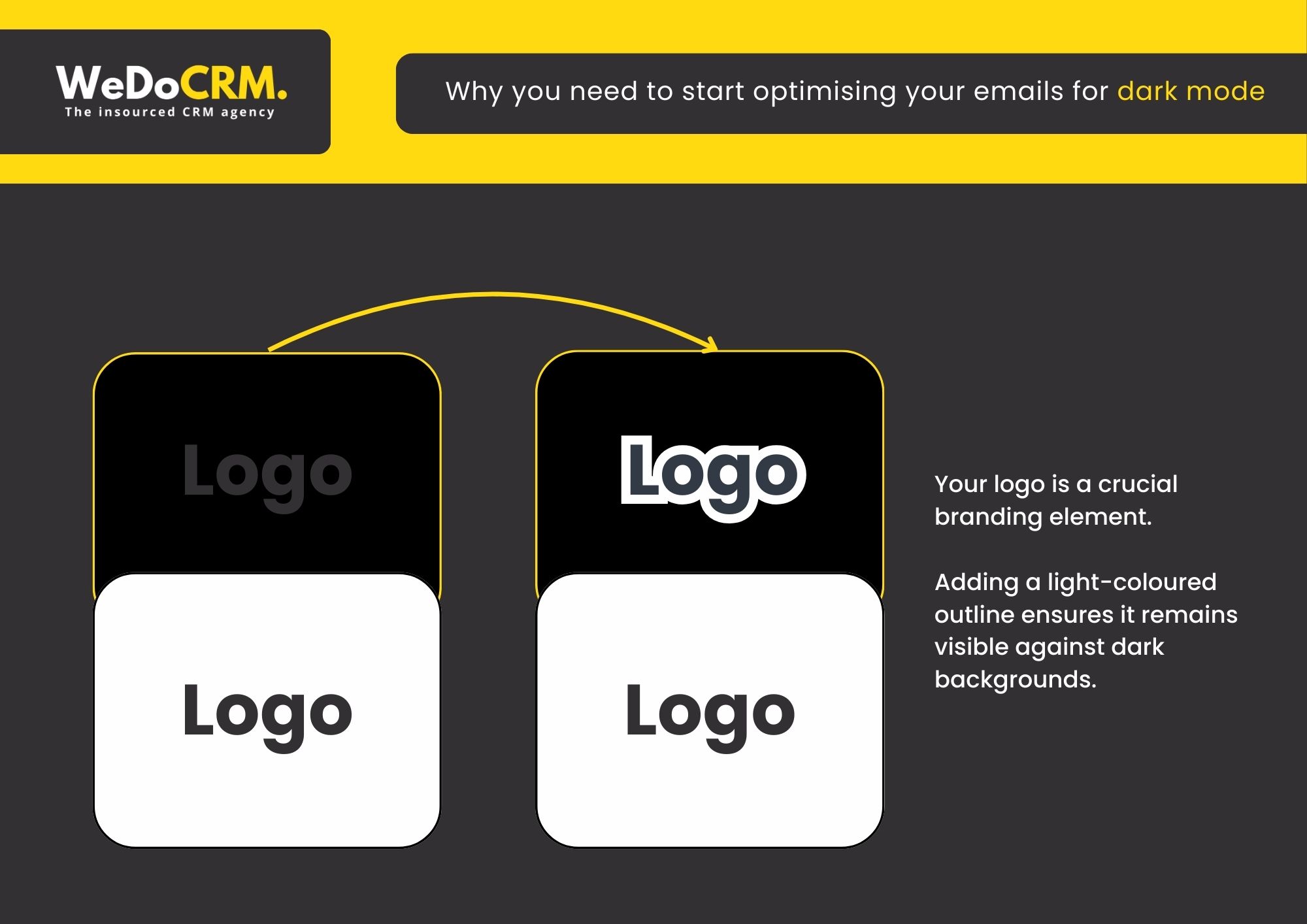
Logo Visibility Problems: The disappearing logo trick! Transparent PNG logos often become invisible against dark backgrounds, compromising brand recognition and professional appearance.
Text Legibility Challenges: The hide-and-seek text! Dark text elements can become unreadable when displayed against dark backgrounds, preventing your message from being properly communicated.
Image Border Inconsistencies: Images without defined borders may appear disconnected from the overall design in dark mode, creating a disjointed visual experience. You don’t want your images looking like they are floating in a void.
Colour Palette Distortion: Carefully selected colour schemes can appear significantly altered in dark mode, potentially creating unintended contrast issues or visual inconsistencies.
“I recently opened an email from my favourite makeup brand, and with dark mode on, all the black text had vanished! Just floating product pics and a mysterious “BUY NOW” button with zero context. Just a gentle reminder that testing emails in dark mode is super important these days! We’ve all been there with tech mishaps.” – Vanessa Mallia Head of Growth at WeDoCRM
What are Common Dark Mode Mistakes?
- Using hard-coded background colours
- Ignoring image transparency
- Not testing across clients
- Relying on colour contrast that breaks when inverted
The Benefits of Dark Mode for Email
Not only does it look slick, but there’s more to it than just aesthetics:
Your Eyes Will Thank You – Have you ever checked your phone at 2 AM and felt like someone shined a flashlight directly into your retinas? Dark mode eliminates that searing pain. The reduced glare means less squinting, less eye strain, and fewer headaches during those late-night email sessions.
Battery Life For Days – If you’ve got a device with an OLED or AMOLED screen (hello, iPhone and Samsung owners), dark mode is like a magic battery extender. It can save up to 63%! Those black pixels turn completely off, consuming significantly less power.
Accessibility That Matters – For people with certain visual sensitivities or conditions like photophobia or dyslexia, dark mode isn’t just nice – it’s necessary. The high contrast between text and background can make content dramatically more readable for many users. (Our marketing consultant is a perfect example; she has Irlen Syndrome and finds dark backgrounds essential for comfortable reading.)
Without dark mode, users might simply avoid your content altogether. When we optimise for dark mode, we’re not just being trendy, we’re making our emails accessible to everyone, and you should too!
Dark Mode Email Optimisation
Email clients like Apple Mail, Gmail, and Outlook now offer dark mode options that many users prefer. Here’s how to ensure your emails look great no matter the display setting:
Testing Essentials
- Preview before sending: Send test emails to yourself using different email apps on various devices
- Use testing platforms: Services like Litmus let you preview your email across multiple inbox providers simultaneously
- Check both modes: Always verify your email appears properly in both light and dark displays
How To Optimise your Emails for Dark Mode
Keeping your messages effective no matter how they’re viewed.
1) Add a stroke around your logo
Your logo is a crucial branding element. Adding a light-coloured outline ensures it remains visible against dark backgrounds.
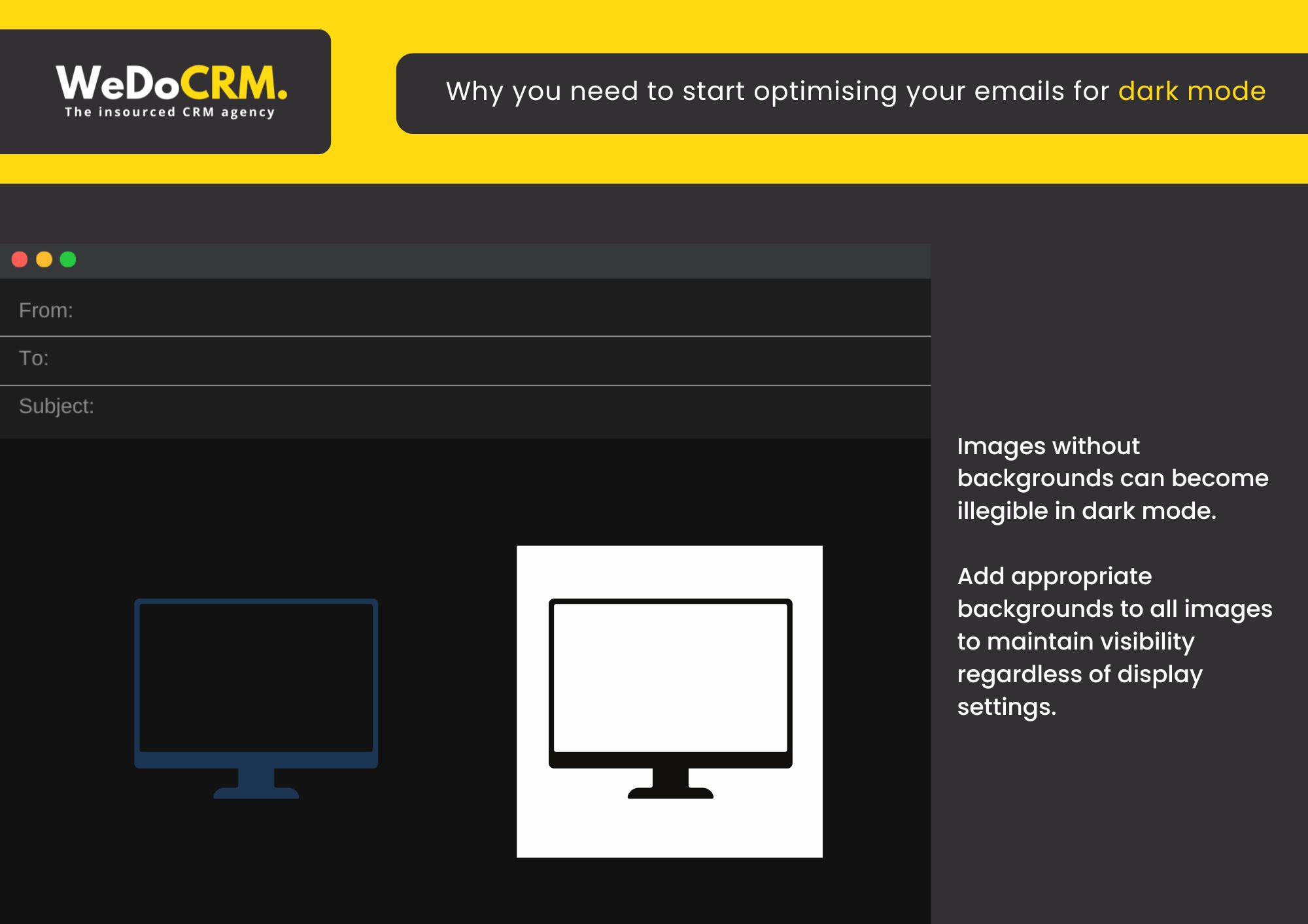
2) Optimise all images for dark mode
Images without backgrounds can become illegible in dark mode. Add appropriate
backgrounds to all images to maintain visibility regardless of display settings.
3) Do a quick accessibility check-up
Before hitting that send button:
- Give your email a once-over in both light and dark modes – can you read everything easily?
- Make sure your links stand out and are easy to spot – nobody should have to hunt for them!
- Double-check that all your “Click Here” and “Shop Now” buttons pop on the screen – these are your conversion drivers after all!
How You Can Shine in Any Mode
Don’t let dark mode leave your carefully crafted emails in the shadows (that’s for the scary monsters!) By implementing these simple optimisation tips, you’ll ensure your messages look professional and engaging for every subscriber, regardless of their display preferences.
At WeDoCRM, we understand that these small details make a big difference in your email marketing performance. That’s why we’ve made dark mode optimisation a standard part of our email marketing services. You can read more about our email services here.
Our email templates utilise the latest HTML, CSS and JavaScript code to ensure the email remains agile in data size and clean in terms of backend code structure in order to pass spam filters and deliver successfully to the recipient’s inbox.
CHAT WITH US →
Remember: When your emails work in both light and dark mode, you’re not just being considerate – you’re being smart about reaching 100% of your audience, 100% of the time.
Dark Mode in Emails: FAQs
Why does dark mode affect my email design?
Email clients like Gmail, Outlook, and Apple Mail may automatically invert or adjust colours when dark mode is enabled. This can alter backgrounds, text colours, and images, sometimes breaking your intended design.
How can I make my emails dark mode-friendly?
To optimise for dark mode:
- Use transparent PNGs instead of images with white backgrounds
- Avoid pure black or pure white extremes
- Add subtle outlines or strokes to logos and icons
- Test emails across multiple clients and devices
Should I design specifically for dark mode?
Yes, but with flexibility. Instead of designing separate versions, aim for a “dark mode safe” design that works in both light and dark environments.
Why do my logos or images disappear in dark mode?
Logos with dark text on transparent backgrounds may become invisible against dark backgrounds. Similarly, white-background images can look harsh or mismatched when colours invert.
Does dark mode improve email engagement?
Indirectly, yes. Dark mode can enhance readability and user comfort, which may improve engagement but only if your design adapts well and remains visually clear.
How can I test my emails in dark mode?
Use tools like Litmus or Email on Acid to preview emails across different clients and modes. You can also manually test by switching your device and email app to dark mode.
What’s the simplest way to future-proof emails for dark mode?
Keep designs clean, use flexible colour palettes, prioritise contrast, and test regularly. A simple, accessible design will perform best across both light and dark modes.
Want more of our insights? Check out:
- Make Your CRM Budget Work Harder This Financial Year – Tips from our CEO
- Why Businesses Are Exploring Alternative CRM Platforms – What CRM Platform is best for you?
- Email Marketing Trends – Find out about the latest trends